How to Build a Mobile-Responsive Web App with React & Material-UI
Introduction
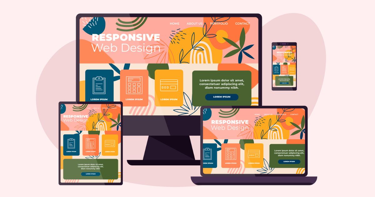
In today’s digital landscape, the responsive web app is crucial to provide a seamless and enjoyable user experience across various devices and screen sizes. In this blog post, I will explore the importance of responsive design and demonstrate how to build a responsive web application using React and Material-UI. Throughout this post, I will cover responsive layout techniques, adaptive components, and handling different screen sizes to ensure our application looks and functions flawlessly on any device.
Why Responsive Web App Matters
Responsive design plays a pivotal role in ensuring that your web app adapts and responds to the user’s device, whether it’s a desktop, tablet, or mobile phone. By eliminating the need for separate designs for different devices, the responsive design enhances development efficiency and reduces maintenance efforts. Additionally, responsive design significantly improves accessibility, increases user engagement, and positively impacts search engine rankings. For further insights on software engineering, visit the Prayers Connect blog. You can visit the Prayers Connect blog to read more about software engineering.
CSS in JS
CSS in JS refers to an innovative approach in web development where CSS styles are written and managed using JavaScript instead of traditional external CSS files. This approach involves defining CSS styles as JavaScript objects or using CSS-like syntax within JavaScript code.
The advantages of CSS in JS are manifold. First, it enhances encapsulation, allowing for more effective component styling. Moreover, it facilitates the creation of dynamic and responsive styles, enabling seamless adaptation to different devices. Additionally, CSS in JS enhances code organization and simplifies dependency management, resulting in more flexible and reusable styles.
What are MUI Breakpoints
MUI breakpoints are responsive breakpoints provided by the Material-UI (MUI) library. In the context of web development, breakpoints define specific screen widths at which the layout of a responsive web application should change. These breakpoints are instrumental in ensuring that the design and components of your application adapt and respond effectively to different screen sizes and devices.
MUI Breakpoints that Can be used to Create Responsive Designs
MUI breakpoints are responsive breakpoints provided by the Material-UI (MUI) library. In the context of web development, breakpoints define specific screen widths at which the layout of a responsive web application should change. These breakpoints are instrumental in ensuring that the design and components of your application adapt and respond effectively to different screen sizes and devices.
MUI Breakpoints that Can Be Used to Create Responsive Designs
Material-UI (MUI) offers a set of predefined breakpoints that can be utilized to create responsive designs. These breakpoints are based on common device sizes and serve as reference points for adapting the layout and styles of components at different screen widths. Let’s explore the default breakpoints provided by Material-UI:
xs (Extra Small): The smallest breakpoint, typically targeting mobile devices. The range spans from 0px to 599.95px.
sm (Small): This breakpoint is designed for small devices like smartphones. It covers a range from 600px to 959.95px.
md (Medium): The medium breakpoint is suitable for tablets and small laptops. It spans from 960px to 1279.95px.
lg (Large): This breakpoint caters to larger devices like laptops and desktops. The range extends from 1280px to 1919.95px.
xl (Extra Large): The extra-large breakpoint represents larger screens, such as large desktop monitors or high-resolution displays. It starts from 1920px.
Getting Started with Responsive Web App
Let’s start by setting up a React project and integrating Material-UI. We will install the necessary dependencies and configure our project to leverage Material-UI’s responsive features. So open your terminal and run this command. Also, you can follow installation guidelines from here.
npm create vite@latestAfter successfully creating React app now let’s install MUI on our React App. Run the below command to your terminal. You can follow MUI installation guidelines from here.
npm install @mui/material @mui/styled-engine-sc styled-componentsSo now we already understood the MUI breakpoints right? let’s see how we can change the app text and font size inside the BreakpointDemo.jsx file. Simply create a new component called BreakpoinDemo.jsx and mount it with the main.jsx file in your react app. Then just copy this code in your BreakpointDemo.jsx
import React, { useState, useEffect } from 'react';
import { useTheme } from '@mui/material/styles';
import { Container, Typography } from '@mui/material';

const BreakpointDemo = () => {
  const theme = useTheme();
  const [currentBreakpoint, setCurrentBreakpoint] = useState('');

  useEffect(() => {
    const handleResize = () => {
      const { breakpoints } = theme;
      let activeBreakpoint = '';

      if (window.innerWidth < breakpoints.values.xs) {
        activeBreakpoint = 'xs';
      } else if (window.innerWidth < breakpoints.values.sm) {
        activeBreakpoint = 'sm';
      } else if (window.innerWidth < breakpoints.values.md) {
        activeBreakpoint = 'md';
      } else if (window.innerWidth < breakpoints.values.lg) {
        activeBreakpoint = 'lg';
      } else {
        activeBreakpoint = 'xl';
      }

      setCurrentBreakpoint(activeBreakpoint);
    };

    window.addEventListener('resize', handleResize);
    handleResize();

    return () => {
      window.removeEventListener('resize', handleResize);
    };
  }, [theme]);

  const getBackgroundColorForBreakpoint = (breakpoint) => {
    switch (breakpoint) {
      case 'xs':
        return 'red';
      case 'sm':
        return 'blue';
      case 'md':
        return 'green';
      case 'lg':
        return 'orange';
      case 'xl':
        return 'purple';
      default:
        return 'white';
    }
  };

  const backgroundColor = getBackgroundColorForBreakpoint(currentBreakpoint);

  return (
    <Container style={{ backgroundColor }}>
      <Typography variant="h2" color="textPrimary">
        Current Breakpoint is: {currentBreakpoint}
      </Typography>
    </Container>
  );
};

export default BreakpointDemo;
- To test it on your browser Open your browser and navigate to
http://localhost:5173(Where your React development Server is running) You should see theBreakpointDemocomponent rendered, and the text background color will change based on the current breakpoint. - Resize your browser window to see the text background color change dynamically as the breakpoint changes.
By following these steps, you will be able to run and test the code in your browser. The BreakpointDemo component will display the current breakpoint and change the text background color accordingly as you resize the window. Are you interested to learn more about React MUI? Then watch this video tutorial.
Mastering Responsive Web App Development with React and MUI
When creating a responsive web application using React and Material-UI, here are some best practices and tips to consider:
- Firstly Plan for Mobile-First Design: Start designing and developing your application with a mobile-first approach. This ensures that the application is optimized for smaller screens and progressively enhanced for larger screens.
- Next Use Material-UI’s Grid System: Material-UI provides a powerful Grid component that simplifies responsive layout creation. Utilize the grid system to create responsive layouts that adapt to different screen sizes.
- In addition, It’s important to Follow Material Design Guidelines: Adhere to the principles and guidelines of Material Design when designing your application’s user interface. This helps maintain consistency and familiarity across different devices and platforms.
- To handle different screen sizes effectively, Utilize Material-UI’s Breakpoints: Take advantage of Material-UI’s built-in breakpoints to handle different screen sizes. Use the responsive props and CSS-in-JS solutions like styled-components or the Material-UI styling system to conditionally apply styles based on breakpoints.
- Ensure thorough testing on Real Devices and Emulators: Ensure you test your application on real devices and emulators representing various screen sizes and orientations. This helps identify and address any issues specific to different devices and form factors.
- Optimize image loading by using responsive images and lazy loading techniques: Optimize the loading of images by using responsive images and lazy loading techniques. Consider using the
imgcomponent provided by Material-UI or popular image optimization libraries.
Enhancing User Experience and App Responsiveness: Tips & Tricks
- Prioritize Content: Firstly, ensure that the most important content is prominently displayed and easily accessible on smaller screens. Prioritize key information and actions to provide a seamless user experience on mobile devices.
- Use Responsive Typography: Next, implement responsive typography that adjusts based on screen size. Use relative units like
remoremto make the text scale appropriately on different devices. Consider using Material-UI’s responsive typography features for consistent and readable text across breakpoints. - Optimize Navigation: In addition, simplify and streamline your navigation for mobile devices. Use techniques like collapsing menus, off-canvas navigation, or bottom navigation to provide a user-friendly experience on smaller screens. Consider using Material-UI’s Drawer or
BottomNavigationcomponents. - Lazy Load Content: To improve performance, implement lazy loading techniques to load content and resources only when needed. This improves initial load times and reduces the amount of data transferred, particularly for mobile users with limited bandwidth.
- Performance Optimization: Lastly, prioritize performance optimization. Minimize the use of heavy animations, unnecessary JavaScript, and excessive DOM manipulation. Optimize the code by removing unused dependencies and applying performance best practices. Consider using tools like code splitting and tree shaking to reduce bundle size and improve load times.
Conclusion
In conclusion, building responsive web apps with React and Material-UI for exceptional user experiences on any device. Implement responsive design, adaptive components, and screen size handling techniques. Check documentation for MUI Breakpoints and the link for the Responsive Layout Grid. Delight users with a seamless experience.
About The Author